# VuePress 完美 embed responsive YouTube 影片
VuePress 是採用 markdown 語法來編輯文章 (透過 markdown-it 套件),所以也支援直接貼上 HTML 語法,那要嵌入 YouTube 影片只要貼上 YouTube 產生的 iframe 語法就可以。
不過這樣有個缺點,就是嵌入的 iframe 沒辦法適應各種不同的解析度,所以就會造成在手機瀏覽時,影片會破版。
那這個問題可以透過 markdown-it 的外掛 markdown-it-video (opens new window) 來解決,就可以完美嵌入 responsive YouTube 影片。
# 安裝 markdown-it-video
首先先安裝 markdown-it-video
npm i @centerforopenscience/markdown-it-video
接著在 .vuepress/config.js 加入 markdown plugins
markdown: {
  plugins: {
    '@centerforopenscience/markdown-it-video': {}
  }
}
在文章中就可以使用 markdown-it-video 的語法,像是下面這樣
@[youtube](https://youtu.be/LtSmfGuHe3o)
# 增加 bootstrap embed-responsive classes
markdown-it-video 除了會產生 YouTube 的 embed 語法之外,還會用一個 div 把 iframe 包起來,那這個 div 有 embed-responsive 這個 class 。
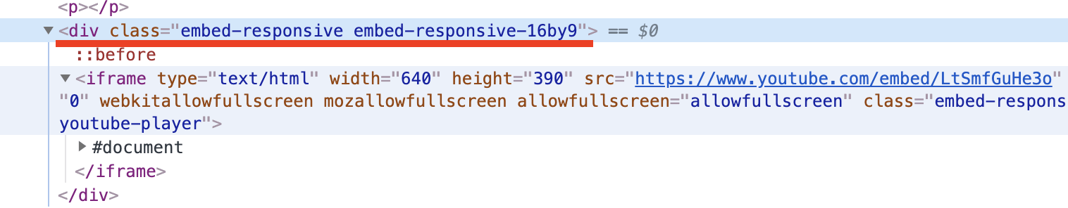
這一系列 embed-responsive class 是 bootstrap 定義的 (Source Code 在這邊 (opens new window)) 。
VuePress 預設的 theme 是沒有這些 class 所以我們要自行加上這些 class 。
VuePress 有提供插入自訂 CSS 的機制,在 .vuepress 資料夾建立 /style/index.styl 就可以 (關於 index.styl 可以參考這邊的說明 (opens new window)),完整路徑是 .vuepress/style/index.styl 。 (styl 是 Stylus 的副檔名, Stylus 是一種用來產生 CSS 的程式語言)
接著在 .vuepress/style/index.styl 加入 bootstrap embed-responsive classes
可以直接插入 CSS
.embed-responsive {
  position: relative;
  display: block;
  width: 100%;
  padding: 0;
  overflow: hidden;
}

.embed-responsive::before {
  display: block;
  content: "";
}

.embed-responsive .embed-responsive-item,
.embed-responsive iframe,
.embed-responsive embed,
.embed-responsive object,
.embed-responsive video {
  position: absolute;
  top: 0;
  bottom: 0;
  left: 0;
  width: 100%;
  height: 100%;
  border: 0;
}

.embed-responsive-21by9::before {
  padding-top: 42.857143%;
}

.embed-responsive-16by9::before {
  padding-top: 56.25%;
}

.embed-responsive-4by3::before {
  padding-top: 75%;
}

.embed-responsive-1by1::before {
  padding-top: 100%;
}
也可以插入 Stylus 語法 (Stylus 語法取自這邊) (opens new window))
.embed-responsive
    position relative
    display block
    width 100%
    padding 0
    overflow hidden
    &::before
        display block
        content ""

.embed-responsive .embed-responsive-item,
.embed-responsive iframe,
.embed-responsive embed,
.embed-responsive object,
.embed-responsive video
    position absolute
    top 0
    bottom 0
    left 0
    width 100%
    height 100%
    border 0

.embed-responsive-21by9
    &::before
        padding-top 42.857143%

.embed-responsive-16by9
    &::before
        padding-top 56.25%

.embed-responsive-4by3
    &::before
        padding-top 75%

.embed-responsive-1by1
    &::before
        padding-top 100%
這樣一來這一系列 embed-responsive classes 就會插入到 theme 的 css ,這樣一來就可以實現完美 embed responsive YouTube 影片。